NEW WEB SITE!


EASIER TO MAINTAIN. AUTOMATICALLY ADAPTS TO THE DEVICE YOU ARE USING AND HOW YOU HOLD IT.

WHY CHANGE THE SITE?
Technologies keep changing.

Today's newer designs are easier to maintain and can display content differently and more quickly, but one of the main reasons for the change was the number of people who now use their mobile phone or tablet as their main way of connecting to the Internet and the content they enjoy.

Our change combines everything - use whatever device you have with you at the time.
The new site presents well on a MAC/PC but automatically adapts to the device the visitor is using including the size of the screen and even how it is held. The website automatically adapts if you turn your phone or tablet vertically or horizontally. If the traditional horizontal style drop down tiered menu can't be presented well on a small screen, the site changes to a vertical menu choice to select from. Pictures are automatically resized and those which can't reasonably be shown on a small screen may even be skipped where older web sites forced the visitor to scroll around the page.

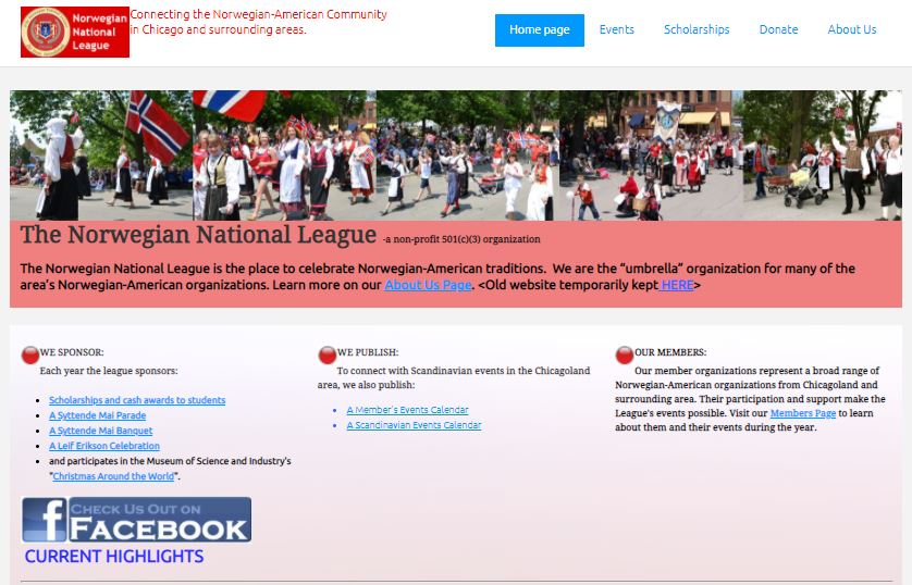
TRY USING DIFFERENT DEVICES


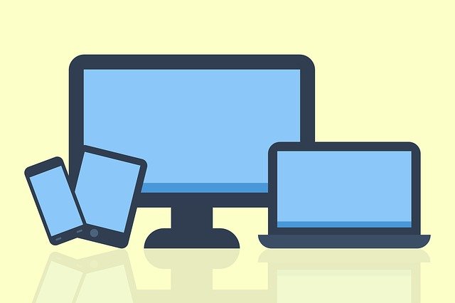
While at the website, turn tablets or smartphones vertical and horizontal and watch what happens. Try the menu, scroll down the pages, switch back and forth. View the content the way that works best for you.